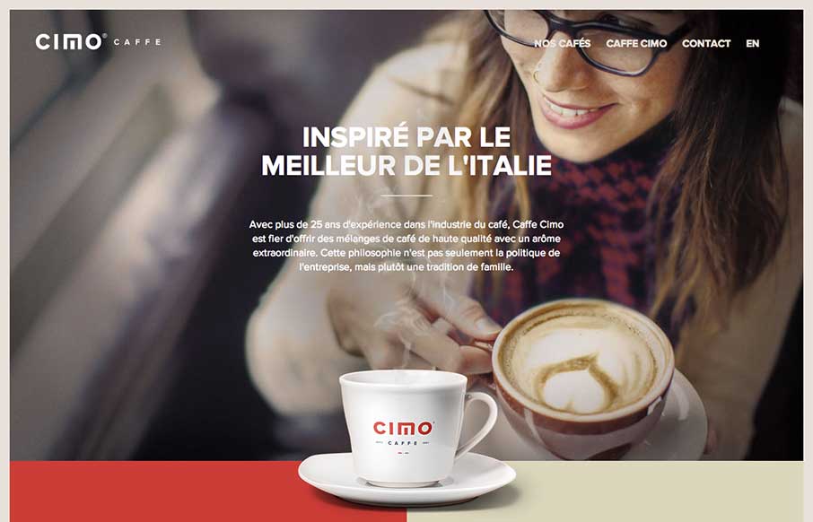
Really nice use of contrast. I’m not just talking about colors, but the way they contrast the photos and real imagery of coffee bags with flat areas of color and blocky bold type and icons. Really gives this page a nice rich visual feel. Love it, now for some coffee.


Glassmorphism: The Transparent Design Trend That Refuses to Fade
Glassmorphism brings transparency, depth, and light back into modern UI. Learn how this “frosted glass” design trend enhances hierarchy, focus, and atmosphere, plus how to implement it in CSS responsibly.


0 Comments