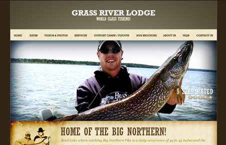
Very nice, complete looking marketing site for this vacation destination. I’m happy the makers of this site pulled it off without making it all flash. Bravo!
Glassmorphism: The Transparent Design Trend That Refuses to Fade
Glassmorphism brings transparency, depth, and light back into modern UI. Learn how this “frosted glass” design trend enhances hierarchy, focus, and atmosphere, plus how to implement it in CSS responsibly.


This site doesn’t look quite finished to me. The rustic/weathered elements look ok on their own, but they’re all cordoned off in their little boxes, there’s no overlap or depth that could really make this site feel finished.
I think it looks pretty ‘finished’ to me. I agree that some overlapping of elements might make it better and pull the sections/boxes of stuff together more though.