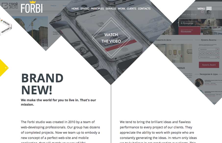
I really like the unconventional way Forbi has their “big pictures” at the top of the site. What follows is very simple and clean, with abstract line drawings as accents, that don’t detract from the content. There are just enough fade ins to give the site some life, with out being heavy. Keep in mind too – they designed this in Russian and English – kudos!


The Call to Action, Revisited
The Call to Action hasn’t changed in a decade, but the bar has. A fresh look at prominence, copy, mobile tap targets, and accessibility, with lessons from three major design systems.


OO
You can download it?