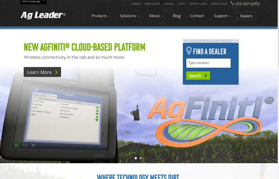
You see these nice responsive sites with their sticky nav and circular images and slick transitions and think, “Yeah, that’s cool, they did everything right.” I’ll be honest, you don’t typically see this much content loaded in and still embody those nice details in such a prominent way. I’m impressed at how the shape, color, typography, image treatments all work together on such a large site like this. The information is organized well and I appreciate the subtle juxtaposition of textured elements with clean UI and type. It plays off the essence of the company itself. Nice work from the guys at FortySeven Media.
Glassmorphism: The Transparent Design Trend That Refuses to Fade
Glassmorphism brings transparency, depth, and light back into modern UI. Learn how this “frosted glass” design trend enhances hierarchy, focus, and atmosphere, plus how to implement it in CSS responsibly.


0 Comments