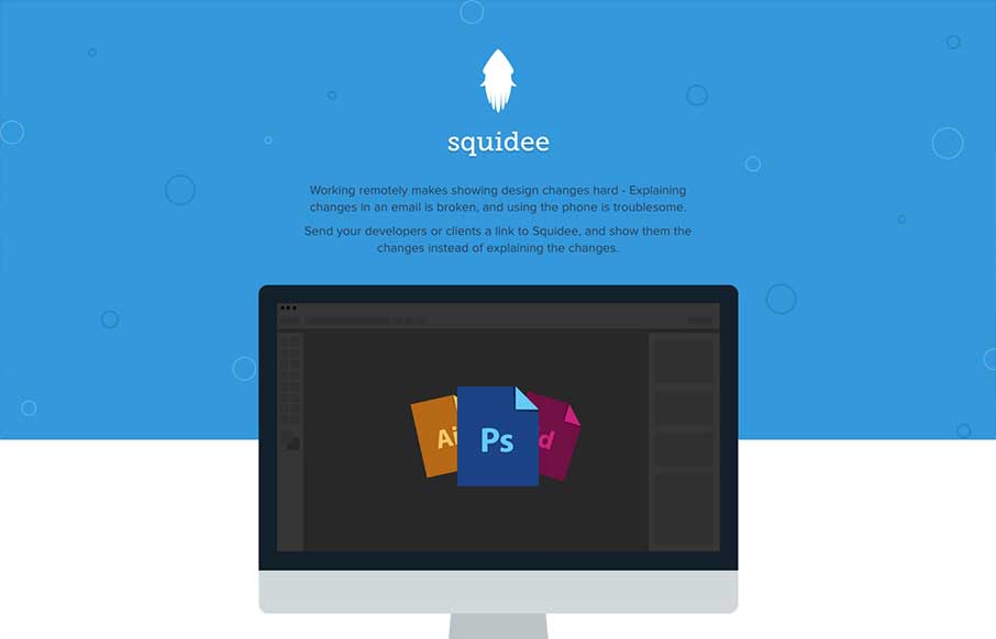
Squidee helps designers send PSDs to frontend developers.
The aesthetic of this site is pretty nice. There’s a very clean use of shape and color which is balanced nicely with the amount and prominence of the type. I like the progression of content, and I dig the subtle way the smooth animations are kind of squid-like in motion. However, I did try to click on the PS icon in the dots; thinking that maybe they’d open a screenshot to represent each text example.
The page finishes with payment plans clearly laid out, and a nice CTA for an invite request. While I feel the bottom of the page is strong visually, there’s one very key component that’s missing before a user should even care about those items. Ironically it falls inline with the tagline of the site: “Don’t explain your changes, show them.” I’m not intentionally trying to nit-pick here but if I’m scrolling down a page, reading examples of what this tool can do, I’d expect the next biggest deal I see to be the showing part of this journey. For this page, that’s the unassuming demo link that they have sandwiched between several lines of text. I’d love to see that given more priority.
That detail aside, I say kudos to the team for using little to do a lot for the promotion of what looks like it could be a really useful app.


0 Comments