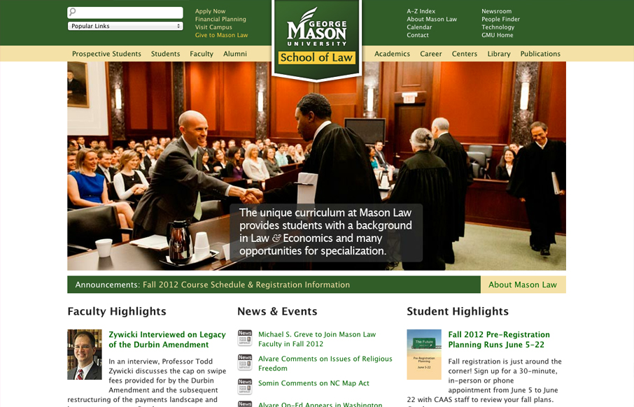
University websites are a great place to study how large sprawling organizations with tons of content handle things. In this case the change in navigation design is largely from the wide horizontal nav structure with drop-down sub elements to the iPhone screen sized nav pattern of just skipping the user down to a site map like experience. In websites like these there’s often 3 or 4 different navigation clusters happening on the same page, it’s confusing. It’s also extremely hard to plan during the architecture phase of a project like this. I commend the creators of this site for approaching a responsive design solution and giving us the different experiences we get on the various screen sizes.

The Call to Action, Revisited
The Call to Action hasn’t changed in a decade, but the bar has. A fresh look at prominence, copy, mobile tap targets, and accessibility, with lessons from three major design systems.


After looking at this for a minute, I just couldn’t put my finger on what was making this site look so… dated. Then it dawned on me. No web fonts. Just plain old Lucida Grande. Isn’t it odd that in such a short time seeing a new site that doesn’t use web fonts is an exception?
Other than that they really did a good job of handling the navigation for smaller screens.
Hi Gene, thank you so much for featuring our site. Appreciate the kind words.
Hi Jay, the site is now updated with custom types. Please check it out. Thanks for your feedback.
Never mind about the new types.