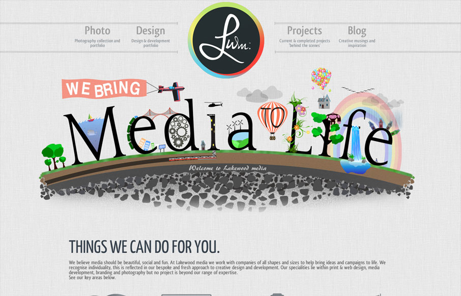
With this website we have aimed to achieve an impacting first response using unique designs and layout. Being a little different is what its all about, the Lakewood media website somehow stays conventional but steps over the perimeter of the norm. A flowing layout has been key to the success, keeping the viewer entertained while feeding information is so important but more than often overseen.
Submitted by: Adam Haworth @adamphaworth
Role: Designer
I particularly like the header logo/navigation block design. The interactions on the nav items is simple yet fun and the slight color shift on the logo mouseover is also a nice touch. Good scan-ability built into the layout too, from the super nice illustration to the slideshow being placed very low in the page scroll it all feels very well “timed” as I look it over. Nice work!


I noticed this site design “borrows” heavily from http://www.builtbymoby.com. The background texture, layout, typography, colors, icon illustration, and even the logo treatment have all been blatantly ripped off. Unmatched Style originally featured Moby’s site on Dec. 19th 2011. https://unmatchedstyle.com/gallery/builtbymobycom.php