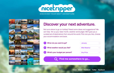
When you get down to it, nicetripper.com isn’t really breaking down any barriers when it comes to design. The site is very simply structured and has almost no complex visual interactions. It makes strong use of photography, big buttons and pastels. All this is great and makes for a pleasant experience but its not really anything new, its just done well. That being said, I think that nnicetripper.com’s home page is compelling. The contrast of highly blurred background to crisp clean foreground makes quite the impression.
Like the rest of the site, the effect is simple. What makes it so nice is the contrast it creates. By having a soft, organic image behind the highly structured text box it accentuates the simple economy of design and makes it much more than it would have been otherwise.


Really cool website! Even though i haven’t any plans for vacation or travel I spent a lot of time browsing around this website just because it looks and feels cool.
i can’t say that i’m a big fan of those competing purples.
i do however like the search result design. they’ve made sure to use quality photos, and not detract from them.
unfortunately the scaling rollover causes my chrome to freeze for a moment, blink to blue or black before the transformation happens. at first i thought it was because they’re not tapping into webkit’s transform scale3d optimization, but i think perhaps the images they’re using (cropped) are simply too big (40 images at 900×600 or thereabouts).
jonah,
Jup, I noticed this freezing while scrolling up and down but it wasn’t that noticeable to ruin overall user experience. They could optimize this loading with jQuery or just make those pictures lower quality.
I didn’t notice the freezing the first time I took a look at this site but since you guys pointed it out, I went back and saw it too. It’s not too bad, could be a little better. Thanks for the keen eye!