
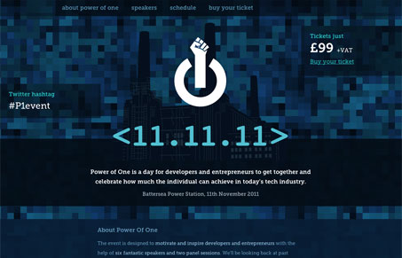
This is like the best single page conference website you can make. There are some initial design problems that Gio points out in the screen cast that relate to text readability, text on dark background sort of deal. Overall though this site is doing some things really right. Like the dynamic scrolling look with the foreground and static background image. It’s like a cheap parallax effect, but it has really great impact and makes it engaging. I also think putting the hashtag up front and center like that is brilliant. Great conference website design here.




0 Comments