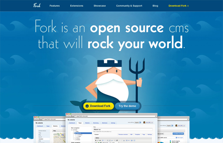
Sweet baby chickens! I love how much great artwork comes across our desks… er, virtual desks… computers… whatever. fork-cms.com has a great set of water mythos illustrations and a simple, open style. The bright colors are friendly and saturated without feeling garish or comical, just fun. I haven’t tried out the CMS just yet but I already like it! Double plus cool for the inclusion of live fonts. Everyone who is helping to make the web look just a little more like a children’s book deserves a medal or something… 🙂
Glassmorphism: The Transparent Design Trend That Refuses to Fade
Glassmorphism brings transparency, depth, and light back into modern UI. Learn how this “frosted glass” design trend enhances hierarchy, focus, and atmosphere, plus how to implement it in CSS responsibly.


great header. love it.
gets a bit complicated in the middle of the page with the extensions and features, but wraps up nicely at the bottom. i’d say a little more care for the central region wouldn’t be a bad idea.