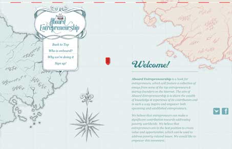
Intriguing visual design for the Aboard Entrepreneurship site. I like the old-timey looking map used for the background and visual metaphor. The static navigation widget is also nifty looking, making for a neat scrolling experience, like you’re on a ship charting your course or something. Cool concept.
Glassmorphism: The Transparent Design Trend That Refuses to Fade
Glassmorphism brings transparency, depth, and light back into modern UI. Learn how this “frosted glass” design trend enhances hierarchy, focus, and atmosphere, plus how to implement it in CSS responsibly.


There is a mistake in the link:
.com8/ >>>>> .com/
Regards