
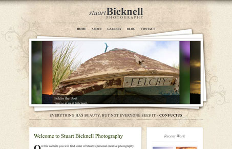
I love the large image slider placed on top of that wonderful textured background. It really adds some depth to the design. I dig the drop caps too! Overall this is a nice clean design despite the textures, the 2 column layout also keeps the site focused visually.




0 Comments