One aspect of designing for the web is about being aware of and adapting to multiple browsers, operating systems, screen resolutions and even bandwidth. And not only do we need to adapt to the physical requirements of the hardware, we also need to think about how our users are going to be interacting with the website.
For example, on a small touchscreen device, it’s a good idea to make buttons or clickable areas obvious and large enough for fingers to tap. We also need to be aware that tried and true methods of interaction like hover states may not work on a touch screen. So we should be looking for ways to modify our layout and interaction depending on the type of device the user is on. One way that we can start to attack some of these issues is by using the extended features of the media query that are new to CSS3. I’ll explain first what they are and how they work and then show how I approached using them on my own website petridisc.com. (Editor Note: This is where I’ve sourced this article from for UMS.)
This seems familiar
The media query has been around for a long time and it’s probably most familiarly used in this context:
<link rel="stylesheet" media="screen" href="testy.css" />The media parameter refers to the type of device we’re rendering on, it’s a limited list and generally we’ve been interested in ‘screen’ and ‘print’.
What’s new?
With the CSS3 specification of the media query, however, we can not only target the type of device we want, but parameters of those devices, like width, resolution, aspect ratio, orientation and more. Now, with a media query, if you want to target browser widths of less than 800px we could serve up a different stylesheet with something like this:
<link rel="stylesheet" media="screen and (max-width: 800px)" href="testy.css" />The same thing can also be accomplished inside the same css file also. I prefer this method and it achieves exactly the same thing:
@media screen and (max-width: 800px) {
      //CSS here to target 800px or less
}
So that’s the basic concept, lets look at a few ways to make use of it.
Putting it to use
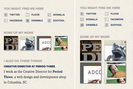
My site is a 2 column fixed-liquid site with a maximum width of 900px, and the left and right columns are set to 70% and 30% respectively. As the browser width gets smaller, the columns scale to keep their relative widths, but as the size gets smaller it starts to get too narrow for the content. There’s no reason we couldn’t target even larger screens, but in this case we want to make our design flexible as the screens and devices get smaller and smaller. It seems logical to start targeting from largest to smallest so my first goal is to target a class of devices/screens that have a width of around 800px. This would include Android phones (when in landscape) and the iPad (in portrait), at least. One thing that happens that I want to address is when the sidebar gets narrow, the social icons start to overlap each other, and I feel like the thumbnails for the work section get too small. So by building off the code above we can add some css inside along these lines:
@media screen and (min-width: 480px) and (max-width: 800px) {

     body {
	line-height: 1.5;
     }

     #sidebar-social ul li,
     #sidebar-portfolio ul li {
	width: 50%;
     }

}
Previously in the css the width of the social icons is set to 33% and the thumbnails is 25%, which makes them 3 and 4 across. By changing it to 50%, it goes to two across, making the thumbnails larger, and giving the text more room. The image below shows what happens for widths larger than 800px, the right is less than 800px.

I’ve also added a couple more things. I added a ‘min-width’ to the query. This will keep it from applying these rules to screens smaller than 480, we’ll be targeting those soon enough. I also changed the overall line-height, based on the recommendation of Andy Clarke in his article on proportional leading.
Down the Rabbit Hole
Now we’re going to target smaller devices, which mainly are going to be smartphones with decent browsers. I honestly haven’t done much serious testing on anything but the iPhone, but I hope to do some more on Android when possible.
We can set ‘min-width’ to 480px, which means we’ll be targeting the iPhone in portrait and landscape orientations. Since the screen is so small, I feel like it would be better if we just focused on the column with the list of posts or just one post and lost the sidebar. But we really don’t want to hide it, do we? It’s still good content. What we can do is remove the floats from the columns and letting the natural order of the html push the sidebar below the main post. We can achieve this like so:
@media screen and (max-device-width: 480px) {

     #sidebar, #posts {
       	 float: none;
    	 width: auto;
    	 padding: 0;
     }

}
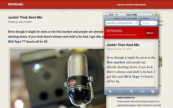
The result, iPhone screenshot overlaid:

The first thing you might notice is that I’ve changed the query to ‘max-device-width’, the ‘device’ is referring to the actual size of the screen, as opposed to ‘max-width’ which would refer to the current size of the browser. Either one really works, but this is specific. I think this is a good start, but it introduces a new problem. All of that sidebar content is pushed all the way down the page with no way to get to it. So what I’ve done is added a link in the html that is hidden by default, and only shows on these smaller devices. I’ve assigned it a class of ‘mobile’, in case I want to apply it to other parts of the page I can just show all things with that class.
HTML:
	<p class="mobile">
		<a href="#aboutme">About »</a>
	</p>

CSS:
@media screen and (max-width: 480px) {
	p.mobile {
		display: block;
	}

	#header p.mobile  {
		float: right;
		padding: .4em 0 0 0;
	}

}
So now, on the iPhone, there’s an ‘About’ button at the top that targets what was the sidebar down near the bottom. As an aside, notice I’m setting values that affect the width in relative units, this ensures that as the page scales down, we have a nice consistent spacing around the elements.
Small screen, fat fingers
I think we need to revisit those social icons. When the screen is a small touchscreen we need to make sure that links are easily ‘tappable’. Once we’ve determined we’re on this device, we can restyle the images to make them more touch-friendly, like so (iPhone on the right):

Only the start
That’s just a few ways to think about using media queries, but the real usefulness of them is getting us to think deeper about the way we design needs to address an increasing array of devices and resolutions and how users are interacting on them.
More Info
There’s been a lot of talk about media queries lately, here are a few good sources:
- Chris Coyier has a good rundown in his post CSS Media Queries & Using Available Space.
- Ethan Marcotte’s article about ‘Responsive Web Design’
- Smashing Magazine’s article about How To Use CSS3 Media Queries To Create a Mobile Version of Your Website
- Simon Collison’s post about his site using Media Queries
- iwalt.com’s post on targeting the iPhone 4 retina display with media queries


0 Comments