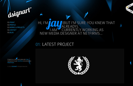
I really like how the blue/misc colored elements are tossed around the page. The typography is pretty tight too. The thing I love about this site is how the colors change up from page to page, it keeps me engaged even though it’s an incredibly simple design change. Good work there!
Glassmorphism: The Transparent Design Trend That Refuses to Fade
Glassmorphism brings transparency, depth, and light back into modern UI. Learn how this “frosted glass” design trend enhances hierarchy, focus, and atmosphere, plus how to implement it in CSS responsibly.


0 Comments