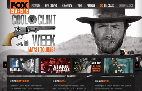
This site uses a lot of forward thinking HTML/CSS techniques to really build depth. The large animated background image of Clint is pretty sweet. It must be amazing to get to work with such cool imagery. Check out the screen cast for our full review.
Glassmorphism: The Transparent Design Trend That Refuses to Fade
Glassmorphism brings transparency, depth, and light back into modern UI. Learn how this “frosted glass” design trend enhances hierarchy, focus, and atmosphere, plus how to implement it in CSS responsibly.


0 Comments