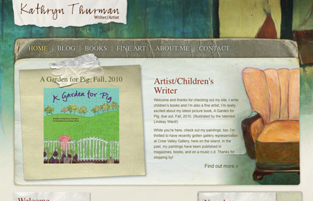
I love the realistic elements worked into this design, and the colors are so rich and inviting. The design kind of falls apart at the latest news section, but overall the design looks great ignoring that part.
Glassmorphism: The Transparent Design Trend That Refuses to Fade
Glassmorphism brings transparency, depth, and light back into modern UI. Learn how this “frosted glass” design trend enhances hierarchy, focus, and atmosphere, plus how to implement it in CSS responsibly.


Home page = 1932 Ko !
The design doesn’t just fall apart at the bottom, it’s basically non-existant. Suddenly the font is Times instead of Arial like in the intro and the images just sit there on an own line. It’s like some CSS is missing.
But looking at the source code I see that all the text at the bottom section is marked up as fourth level headings with a lot of inline styles. So obviously this is a result of the use of the WYSIWYG editor by someone without any experience in web development.
Totally, sometimes a client can wreck a good design. (I’m just assuming there…)