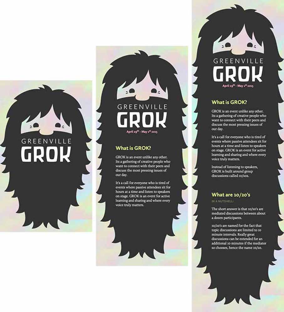
In a recent web project, decided to implement an idea for a giant beard that would grow with the page’s content. The site needed to be responsive and each page needed to accommodate a different amount of content. It would also need to accommodate transparency in the images and work at mobile and desktop sizes.
Example 1 (above) – As content is added to the site, the beard keeps getting longer. It also expands and contracts with the responsive site.
Having done image heavy sites before, I knew that the PNG’s needed to visualize this idea would be very large and I wanted to keep page load times as fast as possible. This prompted me to explore using SVG’s for my images. So, let me give you a quick rundown of my strategy for implementing the SVG background.
We all have a sense for the good qualities of SVGs, but I’ll list them anyway:
- SVG images can be far smaller and load more quickly.
- SVG images can be edited in code with minimal effort.
- SVG is scalable and stays sharp, even at larger sizes.
Example 2 – The site expands by using a repeating beard section (the blue part) as the background for the page content.
In Example 2, the different colored bands represent three different SVG backgrounds. The red section is for the header of the site and didn’t need to repeat. It just needed to seamlessly connect to the blue section of the site.
The blue section holds all of the page content in a single vertical column (see Example 1). This section has a vertically repeating background image that will tile seamlessly and grow with the vertical height of the page.
The green section is just a footer that finishes off the beard and finishes the illusion of a continuous image.
Easy peasy, right? Not quite.
I thought that dropping SVG into my css would be a fairly straight-forward process, but I found that the behavior for repeating SVGs is a little different than bitmap images. Most of these problems are created by responsive design and the floating point numbers that are created by using percentages to determine size.
Managing these issues isn’t that hard, but it took me a while of digging around to find the answers and I thought I’d outline the principal issue here. This article is intended to be as comprehensive as possible so if you have a clear understanding of how to use bitmap images for backgrounds you can probably skip to the “Problems with using SVG” section of this article.
For those of you who just want the high points:
SVG allows control over how the element is scaled within its viewBox with the “preserveAspectRatio” attribute. “preserveAspectRatio” allows you to control how elements are scaled within the viewBox with “align” and allows you to control how the viewBox is framed within the viewport with “meetOrSlice”. You can find the options for these features at Mozilla’s Website.
Why Not Just Use a PNG Background?
See the Pen emvpPJ by Giovanni DiFeterici (@giodif) on CodePen.
Example 3 – The Sharktapus illustration has been sized up from 50px square to 200px square and now the image is blurred and pixellated. So, why not use a PNG? Its a fair question, but the answer is simple: Performance and quality. The main problem with raster images is that they don’t scale well. In a responsive site, we don’t want to load a massive image on a phone and we don’t want to scale up a tiny image for a desktop. Large images increase load times on the page and scaling creates ugly artifacting and blurring. Both of these problems have major drawbacks and very few solutions exist that don’t require multiple versions of the same image and javascript. I didn’t want to create more overhead on the site by including huge .PNG images and I didn’t want to implement a javascript solution if at all possible. To mitigate these problems, I decided to use all SVG for my background images. However, I quickly ran into a strange behavior with my SVGs that i had never before experienced.
So Whats the Problem with SVG?
SVGs are great because, if the imagery is appropriate, they are very lightweight and completely scalable. What looks good on a phone will also look good on a desktop. It even looks perfect on high pixel density screens like the retina display. SVG also render as background images just fine within certain constraints, but responsive layouts can create a major visual problem with continuous patterns and repeating backgrounds of SVGs. So, lets look at an example of the problem:
See the Pen SVG Rendering Issue by Giovanni DiFeterici (@giodif) on CodePen.
Play the animation and notice that part of the time, Example 4a has white horizontal lines flickering between the vertically stacked tiles. These visual artifacts are created by the way that the SVG elements are scaled within the viewBox and the way that the viewBox is framed within the viewPort.
Whew, thats a mouthful.
Example 4b is exactly the same SVG image with one additional property added to control this behavior.
How Do We Fix the Problem?
When I first saw the behavior in Example 4a, I thought that I might have introduced rounding errors by not conforming my SVG to whole number dimensions. To test against this theory, I opened each SVG in Illustrator and resized it so the viewBox wouldn’t have any floating point values. Alas, I still had the same problem.
This problem can be solved in a couple ways. The first is to perfectly scale the SVG elements within the viewbox. This can be done in a program like Illustrator, but complex imagery isn’t always the easiest to handle and sometimes you don’t have control over the art that you’ll be uisng.
Originally, I wanted to know if there was a way for me to handle the problem with pure CSS, but I couldn’t find anything that fit the bill.
I dug around some more and found this page on Mozilla’s site that outlines how to deal with this issue. Really, Mozilla is just spitting out the SVG 1.1 Spec Document from 2011, but I found the Mozilla site first and worked out from there.
What these pages say is that we have available to us an attribute that can be applied to any element that creates a new viewport. In this case it is the SVG image that we want to use for our repeating background. Other elements also create viewports and can use this attribute as well, but I’m not going to dig into that just now.
The attribute in questions is “preserveAspectRatio”:
preserveAspectRatio
Example 5 is an interactive demo that shows how an SVG will render differently depending on the value of “preserveAspectRatio”. The demo defaults to a value of “none”. This means that the aspect ration of the image will not be maintained and the coordinate space of the image will expand and contract to accommodate the dimensions of the viewPort. The effect of this value is that the image will squash and stretch to completely fill the viewPort. Drag the little orange handle to resize the smiley face and see how the SVG squashes and stretches.
See the Pen preserveAspectRatio Demo by Giovanni DiFeterici (@giodif) on CodePen.
Note: In Example 5, the purple rectangle is the viewport, the gray rectangle is the viewBox, and the smiley face is awesome.
Normally, preserveAspectRatio has two components: "align" and "meetOrSlice". These two values tell the browser how to render the SVG within its viewPort.
align
"align" tells the browser the point of reference it should use for resizing the image within its viewport. For instance, a value of “xMinYMin” indicates that the point of alignment is the upper left hand corner of the SVG. A value of “xMidYMid” indicates that the point of alignment is the dead center of the SVG.
meetOrSlice
"meetOrSlice" tells the browser how to frame the viewBox within the viewport. A value of “meet” indicates that the browser should fit the viewBox completely within the viewPort, leaving any additional space blank. It means that the viewBox will never get clipped by the viewPort.
A "meetOrSlice" value of “slice” indicates that the viewBox should completely fill the viewPort, even if it means that the viewBox will be clipped if their aspect ratios don’t match completely.
Play around with the demo until you have a good sense for how “align” and “meetOrSlice” control rendering in SVGs and then we’ll talk about how I used this property to fix my background image problem.
Fixing the Beard
Okay, so how does this new knowledge about “preserveAspectRatio” help us? Turns out we can exerts some control over this situation by specifying that we want the browser to use the “slice” option of “meetOrSlice”. We’ll need to specify an “align” property as well, but the specific option didn’t seem to matter. I chose “xMidYMid” just because it centered up the image and thats what I wanted for the background, in general.
We add the property to the actual SVG element. The following example is a stripped down version of and SVG:
[code]
<svg preserveAspectRatio="xMidYMid slice">
//svg stuff goes here
</svg>
[/code]
Example 6 – How to add the preserveAspectRatio property to an SVG.
Obviously, theres a lot more that goes into an SVG depending on it’s complexity, but adding this property is pretty simple.
As we said before, this property applies to any element that creates a viewPort, which means that you can control parts of an SVG if they are themselves nested SVGs. Take this example:
[code]
<svg>
<svg preserveAspectRatio="xMidYMid slice">
<svg preserveAspectRatio="xMinYMin meet">
</svg>
[/code]
Example 7 – How to control individual the rendering of individual components of an SVG.
In Example 7, you can see that the SVG with a class of outer has no preserveAspectRatio property, so it reverts to it’s default behaviour. However, the two SVGs that it holds have different values applied to the preserveAspectRatio property, so they will handle rendering differently. This level of control is wonderful if we want our SVGs to squash some elements and not others. In the case of my repeating background, I only need to ensure that the SVG retains its aspect ratio and stacks vertically without leaving the flickering white lines at certain screen sizes.
Thats it! This was a fairly long winded article just to explain one property, but I thought building out a couple interactive demos would be helpful for anyone trying to understand how different values of this property affect how their SVG will render.


Great article. Thanks 🙂
now I understand.. thank you.