We’re giving away a copy of ”Don’t Make Me Think!” and “Rocket Surgery Made Easy.” To two randomly chosen commenters, it’ll be the winners’ choice. All you have to do to enter is leave a comment about what your definition of User Experience is or if Dean’s article changed your perspective on UX at all. We’ll randomly pick from the comments in a week’s time.
Relationship Experiences
All of us have been in a relationship at one time or another. Imagine you’re having an important conversation with someone. You’re trying to make things perfectly clear. You want to make sure you’re well understood. Maybe you’re giving someone delicate feedback or you’re breaking up with them. During the conversation, you’re thinking, “I’m doing well, here. I’m being as clear as crystal. The very wall paper in this room knows precisely what I’m talking about.” Only later do you realize that the other person had no clue what you said. You said “Y” and they heard “X.” You said “high” and they heard “low.” They heard something completely different from what you thought you said. You had a misunderstanding. It happens all the time.
Of course, such misunderstandings are (theoretically) avoidable. When speaking to a close friend or spouse, we can say, “I think I’ll be patient. You should talk before me.” Or we can say, “I am not going to bring up contentious points at this terribly inopportune moment. I am not going to attack you personally because I’m just upset. I’ll just chill.” Relationship fixed. Anyone can do this. The problem? These sentiments are extraordinarily counter-intuitive. When you’re mad with someone, you WANT to be mad at them. You don’t want to be patient. You want to get your point across, as forcefully as possible. You are at an impasse.
Let’s keep this in mind as we wrap our brains around this thing called User Experience.
What is User Experience?
It dawned on me recently that, despite working in the industry since 1994, I don’t really know what User Experience is.
So I Googled it:
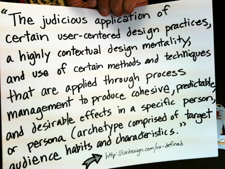
I was perfectly excited with this definition until I fell asleep halfway through reading it. Most of the other definitions I found were similarly obtuse… useless, really, unless you’re an academic.
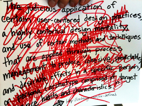
Perhaps people like us can define User Experience. As communications professionals, I’m sure they’ll be perfectly clear and simple about it, right? Here’s what I leaned:
Apparently, experiences have a lifecycle with lots and lots of steps.
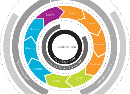
It takes a sea of words to describe good experiences. How good experience? Me not know.
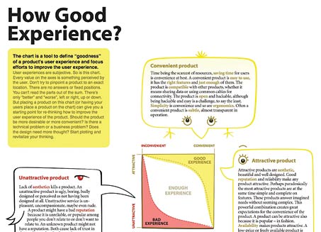
When it comes to User Experience, writers appear to be much more important than programmers (at least according to this chart).
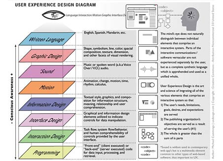
All of these examples (and there are a great many more of them) express the same thing. User Experience is best understood as all the stuff we Web professionals do.
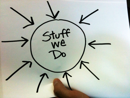
It certainly makes for a simpler chart, but it’s decidedly Us-oriented. This is Web firm narcissism. The important stuff is what we do, how we do it and how we think. What is User Experience? We answer simply, “It’s the sum of all the great stuff we do.” I should know. I’ve made some overly complex UX charts in my day.
It’s all terribly unhelpful. What to do?
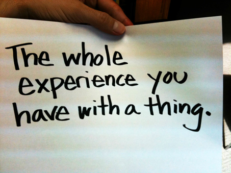
Let’s revisit a chap named Don Norman who essentially coined the term back in the misty recesses of the past. According to Norman, User Experience is quite simply the whole experience you have with a thing.
You can have an experience with a website, mobile app, phone, book, or even a person. You can have an experience with almost anything. Notice, this definition has absolutely nothing to do “all the stuff we do”. It has nothing to do with programming. It has nothing to do with writing. It’s not about usability, architecture or design. We seem to have forgotten that.
We have to change our minds about User Experience. Why did we become so provincial? In order to undo the damage we’ve done to ourselves, let’s dissect further our incorrect notions about User Experience.
PROBLEM 1 – We think we’re smart.
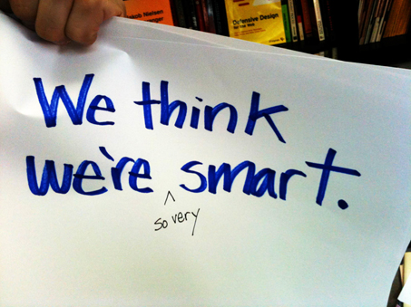
Let’s call a spade a spade. We are smart. We’re brilliant. We can program anything. We can write stealer content. The best thing we bring to the table is our brain. We show up to a client meeting proclaiming, “I have arrived. Have no fear. Your savior apporaches!”
Of course, that’s absolutely wrong.
Think about it. If someone says to you, “I need a website that’s easy to update.” You immediately say, “No problem. I already know the CMS I’ll use and exactly how long it will take.” While the client chatters on about needs and problems, you ponder grid layout, font choice and naturally, Web 2.0 look. You’re done.
If you’re on a corporate UX team, you bring other issues to the table. You bring the pressures of politics. You carry the burden of your corporate culture. You probably fear your superiors. These notions can dominate your efforts.
Want to hire a designer? Little do you know that your needs aren’t all that important. Your designer is more interested in the bleeding edge website they’ve just visited or the prestigious design annual they’ve just read. Don’t worry, they’ll mimic what they’ve seen for you.
Ignorance is no sin.
What if, just what if, we decided to be stupid? Seriously. What if we decided to forget that we know what we know? What if we left our preconceived notions at the door? We might approach problems very differently, wouldn’t we? We might ask the right questions. We might avoid prejudiced assumptions. We might discover that the problem we’re determined to solve isn’t even the correct problem. We might just think of something moderately original as a result.
To do this, you’ll have to unlearn what you have learned.

Consider an old Zen proverb:.The beginner has endless possibilities in mind; the expert, just one or two. If you’re an expert, you’ve already got it figured out. You have nothing new to offer.
Sure it’s weird to glory in ignorance. But when you start at zero, when you start from the beginning, you breathe the invigorating fresh air of possibility. Do this, and you’ll be ready to consider the notion of experience correctly. Then you’ll give yourself the opportunity to leverage all of that outstanding intelligence and experience later.
Bonus: It’s easier to work this way. Show up without the need to know anything. Then get to work.
PROBLEM 2 – We have no empathy for others.
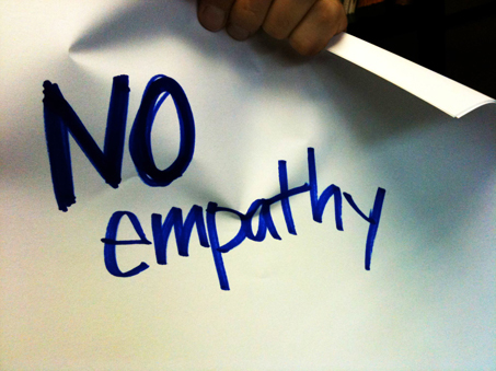
Let’s remember our relationship metaphor. Say we’re arguing, an irresistible force battling an immoveable object. What do each of us want the most? We want the other person to understand what we are saying. If they did, they would see the light. In relationships, we crave mutual understanding. We just want someone to get us.
If an argument is to be resolved, someone will have to take the first step and truly listen without retaliating. Only when we truly understand what the other person feels like to not be understood will we be able to transcend the dispute. This is quite hard to do. If it were easy, all relationships would be perfect.
If you make websites, you have a relationship with the people who use them. Perhaps you think you already understand them. Do you think the majority of people out there can handle something basic like logging in to a service? Do you think they can download a PDF and open it? Do you think they know what a plug-in is, let alone how to use one? I’ve got news for you. Most people have serious, DEF-CON 1 trouble with this stuff, and you need to know why.
You need to understand the so-called “user.”
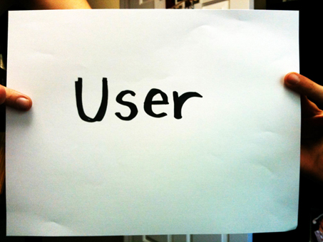
What exactly is a user? When I first got into this field, I thought this was a peculiar term.
It evoked an odd image:

We picked up the term “user” from computer scientists, and it has stuck. Now, It’s simply our standard jargon. It’s so popular, that it has become widely used beyond the confines of our industry. Most people want things to be “user-friendly” and know what is generally meant by this. A certain thing will not be frustrating to use. It will be easy to use, even intuitive.
Web professionals have used the term so much that it has lost meaning. It’s just something we say off-the-cuff without thinking. Many of us take things further than jargon. When we need to push our agenda forward or attack someone else’s ideas, we invoke the mythical “user” to prove our point. That is, we wield the term as a bully wields a club.
- “The user isn’t going to like this.”
- “I don’t think our enterprise users will understand this.”
- “The color red will annoy the users.”
- “The users will want something different from this. I’m sure of it.”
People may offer “user-based” reasons for their opinions, but this is what they really mean:

This is an especially big problem in large corporations. I don’t like a design and the users are an ill-defined, amorphous thing I can blame. I know people do this. I’ve done it. My colleagues have said it, as have clients, conference attendees, authors… you name it.
But I’ve learned something over the years. There are no users. There are only people.
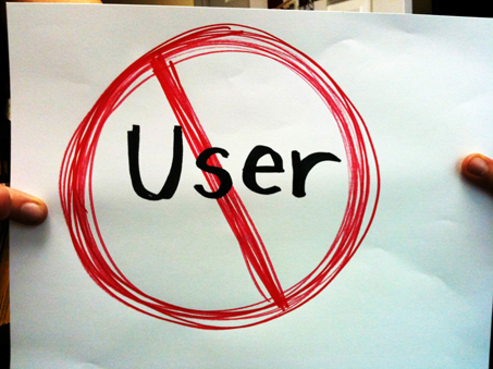
I prefer to avoid the term “user” now; too much baggage. Besides, nobody really thinks they’re a user. People just think they are, well, people. They’re just trying to buy a house, move money from one place to another or sign up for something. Frank wants to know if Stacy still likes him and not Gina. People do things offline and online, simple as that. And let’s face it, you can’t empathize with a user. You can empathize with a person.
Problem 3: We make things up.
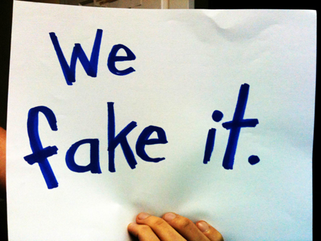
It’s easy to be a Web professional.
Need a great persona or audience archetype? Make it up. Need to figure out what a person is going to do online? Just ask your client. They’ll tell you (or you can make that up, too). Want to build a cool widget site to sell some slick widgets? Rip off someone else’s widget site. Presented with a tough assignment?. Just delve back into your notes, find that little idea you had two months ago, and force it into the project. It will be perfect, because, quite frankly, you’ve been dying to use it.
We’ve all done these things. We’re not malicious. Remember, we’re all very smart and do excellent things, right? And of course we already understand people just fine, thanks.
We fake it for a very simple reason. We don’t really care about people. If we cared about them, we wouldn’t offer them preconceived ideas. We wouldn’t treat them like abstract users. And if we cared about people, we wouldn’t fake anything. So yes, you do actually have to care for the people who use the stuff you make. Really, you should choose to love them.
I can prove the value of this approach. Let’s say you are trying to do something online. You’re buying something. You’re an otherwise completely sane person of temperate disposition. But today, when the checkout process confuses you, your dark side emerges. Directions are unclear. The service doesn’t function as it claims to. Something that should have taken seconds is taking several minutes. You’re not sure if your order went through successfully. The process is driving you crazy. Your hair stands on end as flames erupt from your skull. You mutter curses that would embarrass a Marine.
You’ve had a bad experience.
Imagine that the person buying something online is not you, but is your kind, lovely grandmother. She is the unfortunate one at the mercy of a poorly designed system. It should get you angry. After all, this is GRANDMA. What did she do to deserve this torture?
Now, imagine that you were the person who defined, wrote, coded, and designed the site in question. You have made Grandma miserable. It’s your fault. Feel good about yourself?
Go further. What if, when you designed, defined, wrote, and coded the system, you thought it was perfectly usable, completely intuitive and bulletproof. You were SURE of it.
When you think this way, you have a better chance of understanding the problem. It’s easier to empathize with people when you care about them. When we are concerned about cultivating an important relationship, we want to do things right. We’re careful, attentive, patient and we guard against careless assumptions. The same principles apply to your professional life.
Problem #4 We Take Short Cuts.
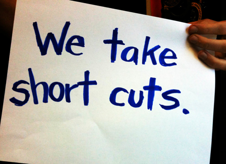
We cut corners all the time. The biggest corner of them all? Most of us don’t talk to the people that use the stuff we make. The danger is clear. If you don’t talk to a person, you cannot have a relationship with them. Web Professionals typically avoid talking to people.
We should to get to know the people who use our websites. We should research their habits, watch them interact with work in progress and get direct input before development. In short, we should involve them in the process. It’s scary, but it works.
But we don’t do this. We prefer to make guesses. We live a professional life of amazing, educated guesses. We do this because we’re smart and we already know what’s best for people.
Developers, would you trust yourself to QA your own code? I hope not. Would a writer edit their own work? No. We instinctively know that we need an external perspective if we want to get things right. But we’ll build things for people without involving them. Why?
Perhaps our budgets are too small, our timelines too short. If we ask “users” something, they’re going to say something stupid. And we’re going to have to implement it! And it’s stupid! Perhaps our boss doesn’t get it. We’re not empowered to speak to customers. Our client isn’t savvy. Involving external people will slow us down!
These are excuses.
That might be hard to hear, but honestly, what are you waiting for? Are you waiting for someone to “get” you? Are you waiting for your client to lead you? Please tell me you’re not. Are you waiting for a client to say, “I bow before your great wisdom, understand everything you do and will never question you again?” Are you waiting for that? Are you waiting for more time? More Money? Are you waiting for permission for your boss, seriously? Good luck.

User Experience is so much more than the stuff we do. And certainly it is more than our collective assumptions, failings and shortcomings. It has far more to do with relationship skills than coding skills.
I’ve purposefully offered no amazing tactic that will help you tweak your website project. I can give you no specific chunk of code or layout idea that changes your Web app today. I simply want to change your mind.
If you change your mind about yourself and the people around you, it will revolutionize your work. You’ll be free to think differently and bring your best self to your next project. No lack of authority or resources will stop you. I am completely sure that you will find the time, budget, permission or authority to excel if you change the way you think about what you do for a living.
You can do it.
– Dean
dean.schuster@truematter.com
Obligatory Further Reading
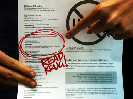
Read more about doing User Experience excellently. If you’re not fond of long lists of books, I suggest two essentials. They are the easiest, shortest books of the lot. Choose ‘”Don’t Make Me Think!” and “Rocket Surgery Made Easy.” by Steve Krug. These books expand on the principles I’ve noted and offer practical steps you can put in place immediately.
BONUS: Additional Sarcasm
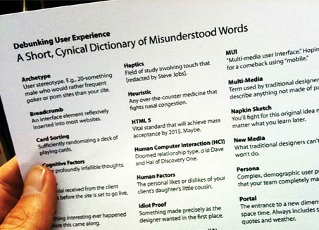
For the devilishly sardonic among you, I’ve created A Short Cynical Dictionary of Misunderstood Words. Read, enjoy. laugh. Hopefully, squirm a bit. Just don’t show it to clients.
Debunking User Experience Handout (PDF)
- Further Reading
- Fancy “No Users” emblem
- Quiz
- Blisteringly tongue-in-cheek UX Dictionary.
About: Dean Schuster
 Founder and partner of truematter (@truematter), an interactive usability consultancy, Dean has championed online simplicity and clarity since the early days of the Web. He oversees truematter’s user experience practice leading strategic engagements for innovative regional firms as well as the Fortune 100. Dean’s expertise, which can never be satisfactorily explained to his mother, includes:
Ethnographic Research
Understanding how people experience technology in context
Design Testing and Prototyping
Testing how people actually use interactive interfaces
Information Architecture
Designing useful systems that work and perform correctly
Application Interface Design
Designing intuitive Web and mobile applications
Dean is past founder of Renaissance Interactive (a dotcom boom/bust story). He also writes about the running sub-culture at zerotoboston.com.
Leave your comment below so you can have a chance to win a copy of ”Don’t Make Me Think!” or “Rocket Surgery Made Easy. Give us your definition of User Experience or tell us if Dean’s article changed your perspective on UX.



Loved Dean’s talk at ConvergeSE. Always as informative as he is entertaining.
To me user experience is exactly what Norman was saying. The uxdesign.com team seems to be trying to define an “ideal user experience methodology”.
Another great article on why we in the industry need to change our way of doing things. I just finished reading “Rework” and “Don’t Make Me Think”, and the changes I’ve made in how I think about planning and developing applications and sites have adapted to our new reality.
Those two books really took the blinders off… this article reinforced many points that the books offered, and gives great advice: remember that you are not making something to fill a need only, you are making it so people can actually use it… and more importantly enjoy it. That’s what keeps people coming back… even if you don’t have all the bells and whistles.
There are so many options on the web, we can’t afford to make applications or sites that people find annoying in the slightest… they will be gone in a few seconds to a competitor who offers something maybe less feature robust, but doesn’t require “navigating through the storm” to use.
His advice was to be empathetic… user experience design revolves around empathy. His talk doesn’t “Debunk” user experience design, it defines it.
Debunking means to expose something as being false. The title of his talk suggests that he is going to show everyone how the concept of user experience doesn’t exist. But the talk is actually his opinions about how to properly approach the UX design workflow.
While I respect a lot of his points, a major flaw in his logic is that he constantly suggests that the client and the user are the same entity. This is commonly not the case. A lot of clients are so familiar with their product, that they are unable to empathize with the person viewing their website. When talking about a CMS or an app that the client is using, the client IS the user. Unfortunately you can’t apply the same blanket workflow to all contexts.
I also found it ironic that he was constantly pointing out how “complex” people make UX to be, yet I found his message largely confusing and disjointed.
That being said, I think the “soul” of his message is a good one… UX designers must remain humble and empathetic, otherwise they are completely missing the point.
The ultimate user experience is invisible or transparent (this seems to be a trendy word these days). It is when the device or program simply disappears between the user (me) and the experience. My first experience with 3D was in Vancouver BC at their IMAX theater. As I sat watching the movie, I was no longer in a room with others, I was not wearing silly looking glasses, I was unaware of the time of day or weather, I simply was experiencing, that is good user experience. On a Kindle, each button that I press does exactly what I had hoped it would do, that is good design.
To me, User Experience is something that is ‘Tangible’, you can feel it. If its a good one, you remember it, and if not, you forget it.
I think best user experience would involve the appearance of careful listening and thoughtful response by a ‘thing’ in a way that responds to you in your own context.
Lots of really good comments here.
Hey Gavan, what do you think a better title would have been for this post? I’m always working on my title writing!
Congratulations on defining UCD (User Centered Design).
None of this new. In fact it predates the web.
So, why did (does) the web suck?
Because it’s hard.
It’s difficult to balance client wants (remember the people paying the bills) with user needs (the people paying the client’s bills). UCD, like a marriage, is difficult – painful at times – but rewarding in the end. It’s also not as simple as dragging a few folks in off the street. It takes research, planning, and patience. It takes understanding that any one user is not representative of all users. In short, UCD is art, not science, but it’s the art of understanding someone else’s needs and packaging them as the best way to solve the problem – rather than, say, your own brilliance.
Good talk though, maybe you won some converts 🙂
One more (does that double my chances of winning a book?)
Norman’s 1st commandment : “know thy user – and you are NOT thy user”.
All else flows from this 🙂
James, only count’s as one entry man! Sorry, but we are giving away 2 books!
I love that Norman quote to BTW! So very true. Someone should make a T-shirt with that.
I can’t add diagrams to the comments here, so if you don’t mind, please see my response to this question (or basically the same question) here:
http://b.qr.ae/ghasZd
I love that UX Honeycomb diagram by Peter Morville Nick!
Really great article. It’s funny how basic some of these things are. The first book in this area I read was the original edition of “Don’t Make Me Think” followed up by numerous books by both Don Norman and Jakob Nielsen. I actually love in Don’s book, “The Design of Everyday Things,” when he goes over something as simple as a door and how there are still countless examples of how aesthetics have completely overshadowed whether or not people would be able to figure out where to push…if pushing is even what is required.
Regarding the web, one of the great quotes I love is “People will spend far more time on other websites than on yours.” This alludes to the fact that very few of us get to decide how to make something work. People come to our websites with an already formed notion of how things should work that they learned somewhere else. We need to learn what that is ourselves and then make sure that we meet our customers’ expectations.
James, that quote about not being the user is one that we have to pull out in our office constantly.
Also, Joan, I love the IMAX comment. Totally agree.
Lastly, and humorous given the content, is that I was looking around for a few seconds for the “submit” button before I actually found it. Just a tip, the submit button should be below the last field on the form….
Thank again for a great piece.
The winners of the Steve Krug book giveaway are Sonali Agrawal & Justin Shearer. Congrats! We’ll email or tweet each of you so you can claim your book.
Thanks for reading and commenting!
UX to me is when “it works”. How? I leave that up to the experts. Crap, that’s me…
PS.: We fake it because sometimes we don’t have another choice… no double-meaning intended.
There’s a bit of cheating here: if you actually visit http://uxdesign.com/ux-defined you’ll find that the definition is not for “User Experience”, it’s for “User Experience Design.” This isn’t just a trivial omission – Dean wants to say that designers are narcissistic, but this can only happen by wrongly conflating the process of UX and the goals of UX, the how and the why. It seems like Dean really did fall asleep while reading that passage, because immediately after it, you find exactly the focus on the user that he claims is absent: “All so that the affects produced meet the user’s own goals and measures of success and enjoyment.”
The misreadings continue: the evidence for the alleged UX designer belief that writing is more important than programming is a diagram illustrating users’ degrees of conscious awareness of various practices. Dean contrasts Don Norman’s simple definition of UX with supposedly overly complex design processes – again, this is comparing apples and oranges, but it’s interesting that in the article Dean quotes, Norman himself says that the term UX has lost it’s meaning: “People use them often without having any idea why, what the word means, its origin, history, or what it’s about.” Doesn’t imply that we’re suffering from a lack of solid, precise definitions rather than too many?
One final point that I think is important: Dean implies that complexity is a bad thing, and the logic is something like our users don’t think about things in complex, precise, academic terms, so we shouldn’t either. But this doesn’t follow at all, why can’t the process of making something easy and simple be hard and complex? This is the case more often than not, because design is hard. Dean treats simple and complex as mutually exclusive binary terms that cannot exist in the same head at the same time, but isn’t the challenge of design precisely to be able to adopt multiple perspectives – simple, complex and in between – not to exclude perspectives?
I was a bit surprised by this article, but maybe I’m out of touch.
To me, I never thought that UX could be anything other than the experience of the user whilst using the product.
And you are telling me there are UX professionals out there who create things without ever talking to the people that will use them? Maybe I’m naive but I find that hard to believe. I always understood that real user research and testing was completely central to what UX is…