Virb.com is a beautifully understated meditation on simplicity and elegance. By careful selection of how much content to show the viewer, virb.com presents a soft and open layout that is easy to scan and establishes a distinct and refined hierarchy. virb.com also puts to good use a subtle but effective smattering of friendly and intuitive microcopy as well as an elegant slider on their homepage that breaks the usual confined rectangle by which most slider’s are restricted and has a subtle layered effect. The website is just superb in its design. These things all work together to drive a really subtle but rich user experience, you just experience good design as you use it, which considering it’s target audience is a must do. I’d like to go through what I notice that makes that experience so nice in detail.
Home Page
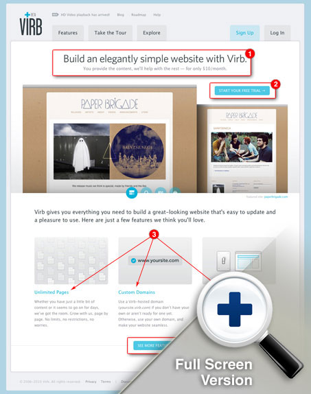
1. Main Headline
This main headline copy is right on, it describes what Virb will let you do and what it will do for you at the same time. It also shares the cost, puts it right up front there for you.
2. Call To Action
The call to action on this site is pretty clever. It’s clearly a “sign up now” button but instead of just stating that straight off, it’s informing you that the next step is that you get to use Virb for a while for free. Thus reducing the risk and friction of first time users. We’ve seen this type of thing before, not going for the kill right away with just “Sign up” but putting the visitor at ease, greatly increases the conversions. Microcopy in your call to action can really make or break your conversions.
3. Marquees
Again, the copy in these little sections is important. The Virb designers look like they’ve gone for highlighting three of the major questions new users might have of the Virb web app. Unlimited Page, Custom Domains and Hosting are all likely sticking points for conversions, answering them up front and clearly in this way gets two thumbs up from me!
4. Secondary Call To Action
I love this secondary call to action down in the footer area. It’s not a sign up button at all but a call for you to dig into more features that Virb has to offer. I really like that and I like the placement of it. We’ve seen in the past, like on the BasecampHQ website that the smart move (backed by data) isn’t to go for the kill with the “sign up now” copy but pushing the visitor towards what your app or service offers instead.
Sign Up Page
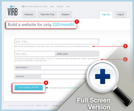
The sign up page on the Virb.com website is super sleek. First off there are only four fields here for you to complete in order to get into a Virb account and start up your website. A couple of the fields are tricky in that they require some understanding of how it all works before you can use it. Also noticeably absent is the “confirm your password” field, which let’s face it, is kind of useless…
1. Headline
The first thing that strikes me is the main headline, it’s super clear “Build a website for only $10/month” with the cost part highlighted further in blue. This is the type of microcopy that makes me happy. It’s quick and informative at the same time. Heck, really you only need to notice the “$10/month” part and you’re good to go.
2 & 3. Help Copy On Form Elements
As I noted above, some of these fields are tricky. You need to know what the Site Title and Site URL are before you can properly use this stuff. Some quick, well written descriptions below the fields inform you and tell you how the info you enter will be used. Smart move there!
4. Submit Button
The submit button is also a part of the process of making the sign up experience smooth. It’s not labeled with “submit” or “continue” it states “Start building your site” which means you’re not done yet, that there’s a next step in the process. But also the fact that it is a submit button gives it a secure feeling like, once I click this i’m in.
Support
The support page is also a great aspect to this website. I have some differences of opinion on some of the details on this page, but overall this is a well done section of the website. Help sections like this can really enhance the user community’s ability to support themselves and drive acceptance of your product.
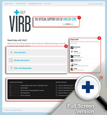
1. Main Search
I like that the page is easily identifiable as the Help Section, the large logo denoting this really informs you of where you are. The other element is the search field, this is where users will dig in. Providing the search is a good move and making it the central aspect to the page is smart.
2. Action Zones
I love these oversized buttons or areas that drive you to three of the top aspects of the support section. Asking a question, looking over the message board and reading FAQs are the main objectives you seek when coming to any help section.
3. Staff Listing
I’m not entirely sure what the point of having the staff listing is there for. Outside of simply showing that there are live Virb staff people behind the help documentation it has little to no extra value. Especially since they aren’t linked to any more detail or contact info.
4. The Meat
This is really partly the main aspect of the Support section, listing recent questions and conversations is a very accommodating piece of the functionality. I really want this small part of the page to be larger and have more importance. Very smart to include that stuff on the main page too though.
Roadmap
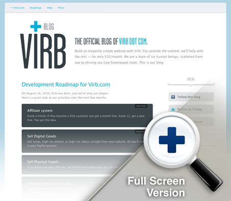
I love the roadmap page, it gives users of Virb a nice list of what’s coming and almost when it’s coming. It’s basically just a big list of what’s on the slate for development. But the way it’s listed, with the dark blocks slowly graying out as you get farther away from what’s being currently worked on is such an easy way to communicate that.
Email Templates
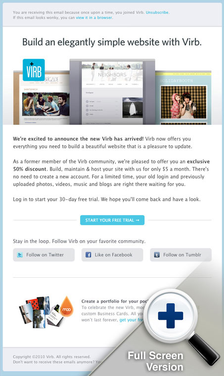
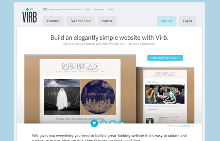
The email message design shares the same overall look and feel of the Virb.com website. It’s clean and very sleek looking. This specific example is an intro to Virb message, with the superbly written headline “Build an elegantly simple website with Virb” and then getting right into it with some nice imagery of virb sites and clear copy. The thing I like is the call to action “start your free trial” it’s the same one that’s on the home page, the same rules apply here. Then the kicker at the bottom the free MOO cards, super strong finish.
Summary
Overall I thoroughly enjoy this new version of Virb.com. It’s not just a relaunch though, this thing is a completely new website and app, from concept to execution they just hit the restart button. The experience of going through this website gives me so many great ideas for how to improve my own website projects. I hope you can get something out of it. There is so much more to go through on the new Virb.com. I didn’t even touch on the app itself, which is also an elegant solution all its own.
Go there and experience it for yourself, please let me know your own experiences with the site too.


cool….. simple and clean