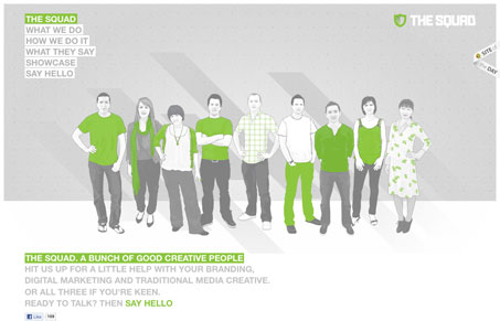
Off the bat, this site looked coo wIth the big illustration of the team members. When you click on a team member it loads them in the foreground – nice effect. I really like the feel of this site. The gray tones with the green worked on top of it all is very nice. Then every page has a nice illustration and slight differences to keep it engaging. It’s all clean and organized feeling. Very nice.


0 Comments