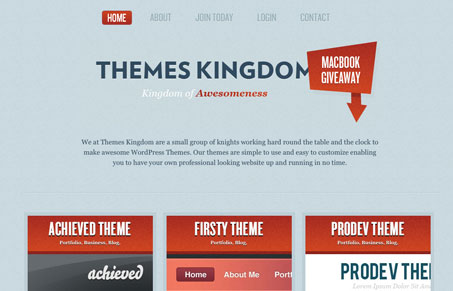
Nice solid typography and color in this design. I also really like the soft feel to the type on this background compared to the hard or loudness of the red used throughout the site. The conceptual portion of this site is good too, the “kingdom” or “knight” stuff is pretty cool. I think it could have been taken pretty far but I like the conceptual work here. They have some pretty sweet looking themes too.


I’m pretty sure you’re breaking Hoefler & Frere-Jones’s license agreement by embedding Knockout.