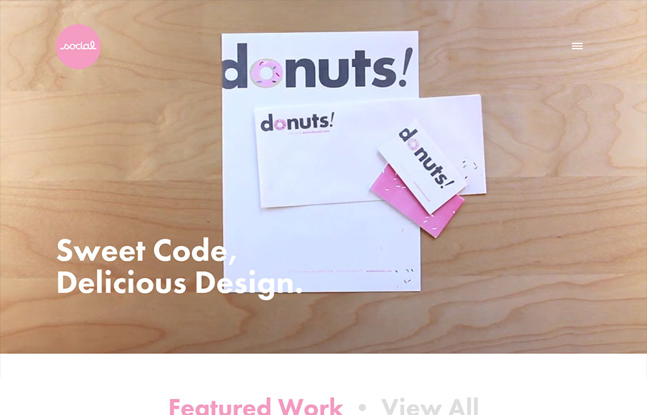
I’ve always like the video on Social’s home page, so I’m glad they’ve found ways to utilize it with each redesign of the site. I especially like the consideration they take when the site’s viewed on a smaller device. It’s smartly responsive, and not having the video auto play is respectful of data usage. Overall, I like the fun liberties they take with animation and how they’ve managed to pull off a bold 50/50 2 column layout but make it feel anything but sterile and rigid.
If I had to pick a less than appetizing sprinkle about the site I’d say that the main nav gets a little lost by only being accessible via the hamburger icon and no where else. Especially on a page like this: http://socialdesignhouse.com/work/joe-ledbetter/ where the contrast is very low. Maybe some alternate link/path in the page footer would help, I’m not sure.
All things considered, there are a lot of nice details that really seem thought out and relevant to the Social Design House brand.


Thanks for the shout out Maria! We completely agree about the nav. Been working on an alternative over here…
Nice! And, keep up the good work!