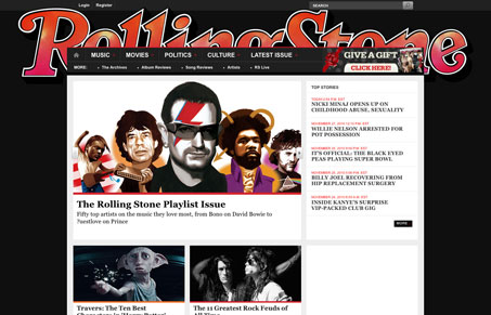
A surprisingly much simpler layout for the new Rollingstone website. I love the grid & modular design. Using the logo in the header area as a background image like that is also really nice. The logotype is so recognizable we don’t need to see the entire thing to know what it is. They’ve also managed to not blind us with ads – superb! Overall I think it’s a really great redesign, some really good decisions layout and type wise.


I like the grid layout but I don’t like the typography; specifically, the styling of headings and text-links. The red from Rolling Stone logo would be a great highlight colour, but it’s been misused for non-clickable sub-headings. I don’t think that a serif font fits the brand at all, and the serif text just clashes with sans-serif text. Links on article pages are too faint, and the ones that lead to galleries and such look weird as centered blockquotes; there should be thumbails to make the copy look less disjointed. I like the large thumbnail images, but the typography spoils the look.