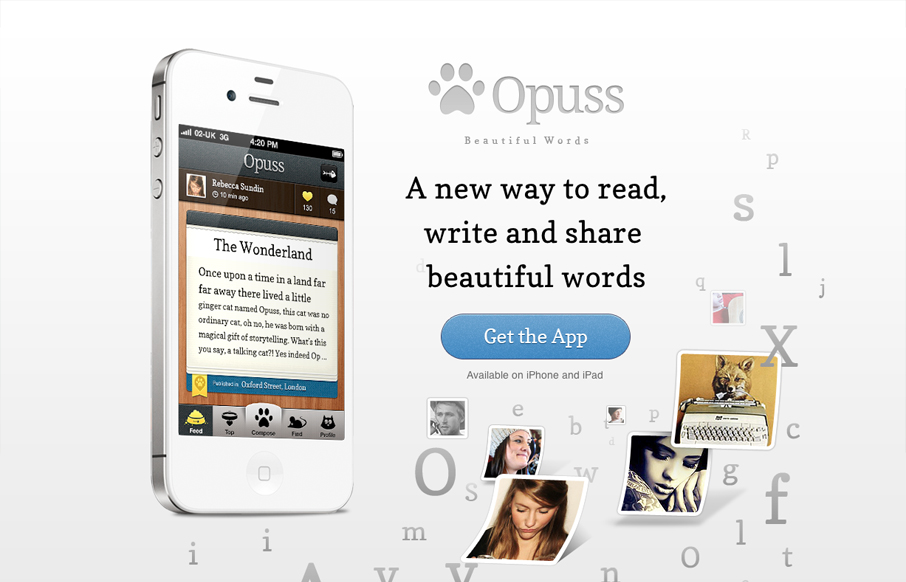
Tons of app sites have pretty much the same structure. On one side of the layout, a large image of an iPbone (of course, with the app onscreen) dominates the composition. On the other side of the layout, the main tagline tells us how the app will change our lives. We’ve all seen it before, but Opuss takes this basic composition and does something more with it.
I really love the organic qualities of the design, which is really a blend of multiple components into the type of crystallographic composition that many designers avoid. The graphic treatment of letters and small images creates a rounder and more organic shape than we see in most web designs and though I might have created a little more visual separation between the content and the art, the design is energetic and appealing.


0 Comments