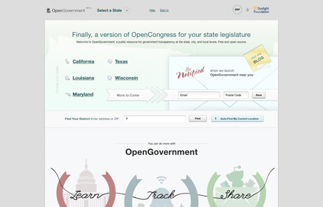
OpenGovernment is “a public resource for government transparency at the state, city, and local levels. Free and open-source.” The design really backs up this message of openness and transparency through the use of light, almost monochromatic graphics, just enough shadow to create a small amount of depth, and lots of white space. It’s openness and simplicity makes it seem trustworthy. Everything is very defined and intentional. The light gray borders around graphical elements allow them to be subtle and defined but still prominent enough to catch your eye. Overall, this is a really successful site.
Monochrome Minimalism
Monochrome Minimalism merges Bauhaus discipline with IKEA simplicity. Clean grids, muted tones, and functional beauty create digital calm, proof that restraint, not decoration, defines timeless design.


0 Comments