
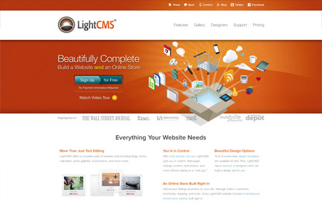
Lightcms.com has a bright and friendly design with just enough graphical flair to emphasize content and not overwhelm it. The colors are especially nice. lightcms.com has a simple structure thats pretty easy to scan and cuts to the chase. You know exactly what you are looking at the second you drop onto the site and well crafted copy helps that along. The pricing page is pretty nice too.




0 Comments