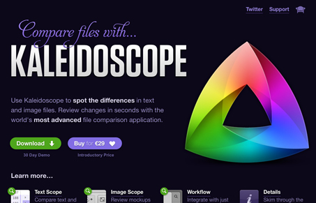
This site has a lot of character. It utilizes brilliant color and bold shapes to divide its content separate areas. In general, this works really well to create a distinct, visually appealing site. The single page structure works well when using the nav bar but seems a little awkward when scrolling the page because the differences between content areas are so dramatic. Perhaps implement some method of removing the scroll bar?
One aspect of the site that I think could use some work would be the microcopy. Many of the headers are somewhat cryptic. They have a lot of character and fit well within the mood and tone of the site but ‘spot on’ and ‘plays nice’ aren’t particularly informative. Other headers have just as much character and inform the reader. A little more attention to that would go a long way into quickly informing the reader about the product.
Lastly, while the site is lush and beautiful, a little more attention could be placed on establishing a visual hierarchy for the information. The info seems a little scattered in places and can be somewhat hard to sift through.
Lastly, lastly, beautiful saturation on the main graphic. I like the conceptual relationship between the graphic and the product.


Love this site. It has a lot of great design elements for the the Webkit folks they get to see their icon slowly animate. Very subtle and very awesome.
I agree with this being overwhelming on the information end. I think it just may be too much for a one-pager. I did a double take when I scrolled from the first purple section to the white background and had to make sure I was still on the same site!
@bermonpainter thanks for pointing out the animation! I must be moving too fast haha
This is an amazing little site. It does aspire to present a large amount of information on one page, but offers it in a way that completely befits the product. It’s giving me, as the audience, one simple message: ‘I can do a lot and I’ll do it cleanly and with style: please try or buy me!’
One tiny gripe though: I haven’t visited kaleidoscope.com on every possible browser, but up until now I can say the message clearly comes across best on webkit based (desktop) browsers.
The “buy” page is a thing of beauty. Every exacting little detail is there on that purchase page. Check it out.