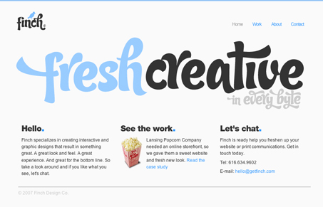
There’s not much to this website, but the design is fresh. I like the color choices and the typeface choice is unique.
There’s not much to this website, but the design is fresh. I like the color choices and the typeface choice is unique.


A modern guide to UI design grids, learn how to build flexible 12-column and 4-column systems, master margins, gutters, and modules, and apply today’s responsive layout best practices.

How can understanding mental models transform your web design process? These cognitive blueprints shape perceptions and decisions, leading to intuitive, user-centered designs.
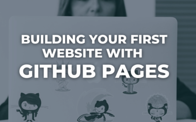
Learn how to build and publish a simple website using GitHub Pages. This beginner-friendly guide covers each step with clear visuals, helping you launch your site quickly and for free.
The typeface is excellent. I love it.
Does anyone know which type is it?
the fact that there isn’t much to this site is the best part about it, so may designers feel the need to ‘fill’ there sites up with stuff, this site is a perfect example of the right way to advertise yourself, the homepage even looks like a big banner you’d see on a the side of a bus…
10/10 Finch !
i really don’t like the site at all. the guy totally ripped off finch papers which i believe is a registered trademark. the font is cool but really pretentious. the guy probably submitted the site himself to get attention.
The type is called Candy, available at veer.com
Thank you Erik.