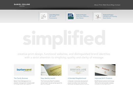
The tagline reads “Simplified” and that is certainly what Daniel has done with his site. Simplified it. There’s nothing extravagant, the colours are subtle yet pleasing, and the layout, although not totally unique, is nicely laid out.
If I did have to make a few points however, it would be the choice of images over text. The word simplified for example and the accompanied paragraph underneath could quite easily have been achieved using text and still given the visitor the same effect. Also, the sub-navigation is floated right. Had those been centered, I feel it would’ve given it a more polished look.
The portfolio though is where the site shines. Not only does Daniel have some high quality work, but the way he has chosen to display them I find very appealing. Using a modified version of the jQuery Galleria plug-in, and his own method of screen capturing, Daniel has created something both useable and attractive while also straying from the over-the-top-use-of-JavaScript seen scattered around the web today.
The blog is also very nicely laid out. Keeping in line with the website’s look and feel but throwing in a gentle mix of blue and orange for good measure.
Overall a very well designed site that Daniel should be proud to show off.


Very classic and well done simplicity. I agree that the blog and portfolio are the best parts of this site. Blog is nicely organized and I really appreciate the color that he brought in to help with that. I love to see blogs with little previews like this so I can choose which one I want to read into. I do wish the thumbnails on those were linked – I’m a big “picture clicker” haha.
Also, maybe I’m boring but I’d love to see one overall, traditional screenshot of each project in the portfolio. Sometimes I’m not sure what I’m looking at..
While I like the simplicity of this site, it has a bit of a disjointed feel, as if many of the elements were designed independently of each other. I like the layout of the portfolio, as a distinct piece, but it doesn’t look much like other parts of the site.
There’s also a bit lacking in the execution. Like Mark, said, some of the text could (should?) be set in live text. The logo, which is also an image, is blurry for some reason, and the navigation links are too close together. It read as a sentence, as opposed to a list, when I first looked at it. Also, I think the design would be much better if the gray bar below the header wasn’t there at all. I think it would make that stark white with the single word stand out even more.
Thanks for the great feedback! As with any personal project, it’s a work in progress.
FYI, aside from the big word “simplified” and the category heads on the blog side bar, all text is live text – some using Cufón font replacement.
Thanks again!