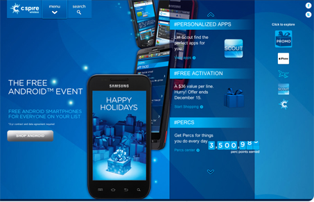
My first impression was that this is a different and almost strange layout. I thought “Where am I going to look first?” But very quickly I found myself engaging with the site in a way that somehow felt natural. The compartmentalization (dang that’s a long word) works and kind of mimics a mobile app environment which is neat. The color scheme is mostly monochrome but has a nice layered depth. The vertical parallax adds a nice touch too. The product results page seems disjointed from the rest of the site but overall there are some nice details considered here.


The Terminal Frontier: A Web Designer’s Unexpected Superpower
Unlock hidden superpowers with essential command line skills every web designer should know. Boost efficiency, control your workflow, and gain confidence by mastering the tools behind the scenes.


0 Comments