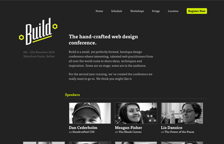
Love the layout of this page, the grid is nicely used here – especially the way the extra head shot sticks off to the side under the logo area. Speaking of the logo, I love that logo design and the colors are quite nice as well. The only negative thing I have to say about this conference website is that I can’t make it to the conference – bummer…


I really had mixed feelings about this design, the layout was nice enough, the type was nice enough, and even the logo was nice enough, but that’s the thing… It’s just “nice enough”.
And for some odd reason, I kinda dig it and it works.The site allows the user to navigate freely without the design getting in the way of the intention. It’s pared down, plenty of white (black in this case) space, and what Seth Godin would call ‘the banana’, something I can click on.
My feelings are no longer mixed, and the UX has won me over. This design rocks
Hah, nice Isacc, I agree with you 100% on your synopsis of your viewing experience. In the end I love the subtlety of this design it overpowers any other feelings I have of it.
Nice simple design. Loving the dark background with green text. Could have done with more user interaction though. The only thing I noticed was the a tags fading to green when you hovered over them.