
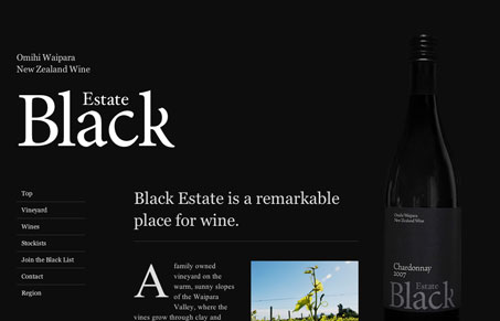
This is a compelling single page “long scrolling” site design. I think the dark black background is kind of played out for a wine site, but I love the big bold typography and the way things feel offset yet still balanced. The very bottom of the page, the region, section is really well done too, simple but well done.


The Call to Action, Revisited
The Call to Action hasn’t changed in a decade, but the bar has. A fresh look at prominence, copy, mobile tap targets, and accessibility, with lessons from three major design systems.

The design is technically quite clever, for example the navigation which is fixed but doesn’t start moving until it meets the top of the screen. It is a little annoying when the navigation passes over an element of the page, for example the wine bottle half way down. This is particularly problematic on smaller screens.