
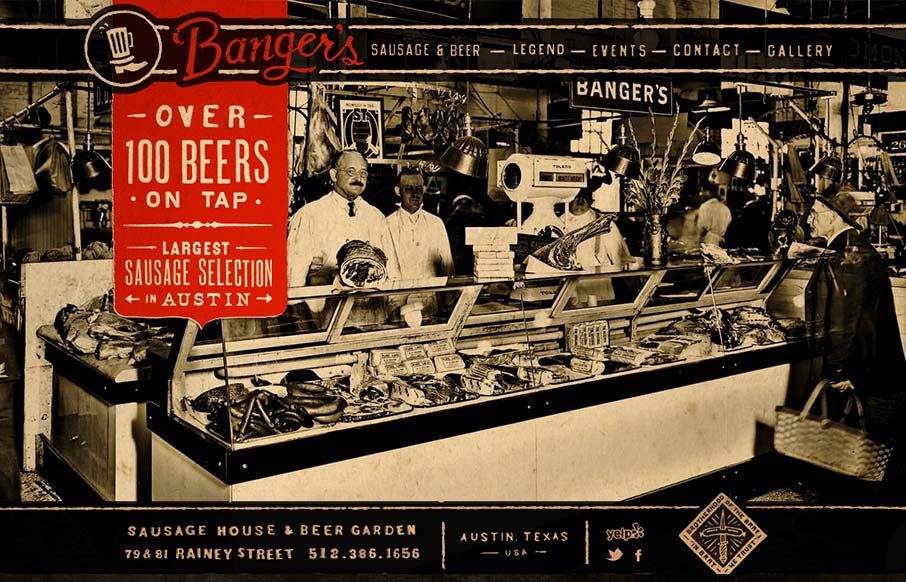
Such a visually rich design. I love the distressed graphic feel to this and the red really makes it “pop” (that was sarcasm, did I just make some of you designer’s brains explode?). It looks like there’s a slight parallax with the background and content too, very nice subtle touch that creates just a bit of movement. I really love the location pin on the map too, small detail but it’s very nice.


Fitts’s Law: Why the Easy Button Wins
Large, close targets are faster to hit than small, distant ones, that’s Fitts’s Law. A look at the 1954 rule behind buttons, prime and magic pixels, thumb zones, and dark patterns.


0 Comments