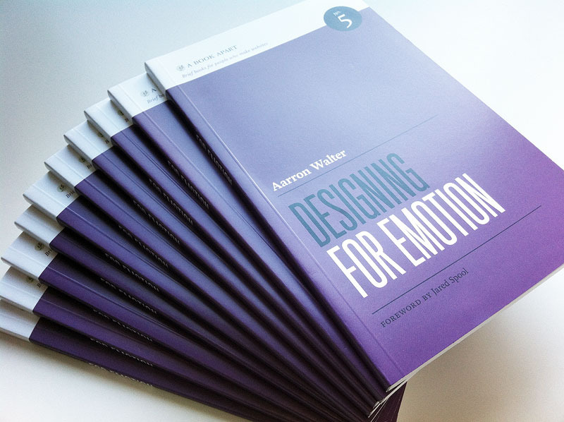
Aarron Walter’s concepts in Designing for Emotion (new from A Book Apart) are invigorating. We’ve seen this stuff before in the wild, but Aarron takes it and bundles it up for us and properly explores the how’s and why’s of what’s in it for us as Designers and User Experience experts. Behind it all he’s showing us how to give our websites and apps a human feel. Teaching us how to connect with our users/customers on an emotional level and while we’re all in that process build good will. We cover all that stuff in our interview as well as Mailchimp.com’s recent(ish) redesign.
Giveaway
I like the book so much I want to give away a copy to one or two of you. Please leave a comment about something or somewhere you’ve seen a decent example of emotional design in practice and we’ll randomly pick a couple of you to send a fresh copy of the book too. Get commenting!
 Picture source A Book Apart.
About: Aarron Walter
 Aarron (aarronwalter.com) is the lead user experience designer for Mailchimp, author of Designing for Emotion from A Book Apart and Building Findable Websites: Web Standards, SEO, and Beyond (New Riders, 2008). He is also and educator having taught interactive design courses at colleges like Temple University, The University of Georgia, and The Art Institute of Atlanta and also leads the development of the InterACT curriculum project.


I look forward to reading the book. Maybe i can get a free copy. Haha!
Hovering over whether to purchase designing for emotion + mobile first as a bundle from a book apart.
https://cernerhealth.com/ does a great job of using principles of designing for emotion to help manage health.
Would loooove a copy of the book!
One site that sticks in my mind is http://benthebodyguard.com/, it’s been around a while now but I still love it, the style reminds me of GTA.
I really really like this one here:
http://www.behance.net/gallery/BR-DESIGN/2315852
So clean, so emotional, so strong!
Been hearing so much about this lately I definitely want to read this book.
I really like this one here: http://cameronreynoldsflatt.com/
bold bright colours.
The profile image of Steve Jobs juxtaposed in the Apple logo definitelt strikes an emotional note.
http://a.abcnews.com/images/US/ht_steve_jobs_apple_tumblr_nt_111006_wg.jpg
Dang Alissa, that’s a great site. Thanks for sharing that one!
@Sven – that branding is top-notch!
@Steve – It sure does, super smart whomever came up with that one for sure.
Highly inspiring for me! http://www.moodyinternationalllc.com/
A great talk. I’ve been looking forward to this book for a while now. I think designing for emotion is really important and often overlooked. Thank Aarron for drawing so much attention to it.
http://slaveryfootprint.org/ does it for me.
This looks interesting. The way Aaron talks about it, it seems that this book is not as much a “How-to” guide, as it is an informational awareness (for lack of a better term.) Designing for emotion seems to be a tool that is very beneficial to have, yet it needs to be a skill-set that is constantly running in the background as second hand knowledge. I really want to check into this, I’m always up for a new way of approaching a project. Who knows, maybe it will help prevent some of those user experience problems before time is wasted creating them. We’ll see.
http://charlestonly.com does it for me 🙂
Congrats to Steve Robillard – he won the drawing for the book! Enjoy Steve!
The “You vs. John Paulson” site definitely made me feel something:
http://mahifx.com/
I love to read this book, I am a very emotional person!
Would love a copy! Hope I haven’t missed the boat.
Hey Jeff (and others) yep, gave it away on Wednesday, three comments up.
Stay tuned to other UMS posts though, we give away stuff about every other week.