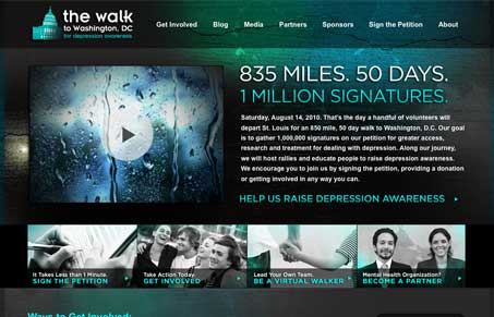
I like the colors and the background imagery. It has an alarming feel to it which I think is the point, to draw you into the need to address this issue it’s informing you of. There’s some neat stuff visually going on with the boxes in the right hand sidebar on the sub pages too.
Glassmorphism: The Transparent Design Trend That Refuses to Fade
Glassmorphism brings transparency, depth, and light back into modern UI. Learn how this “frosted glass” design trend enhances hierarchy, focus, and atmosphere, plus how to implement it in CSS responsibly.


0 Comments