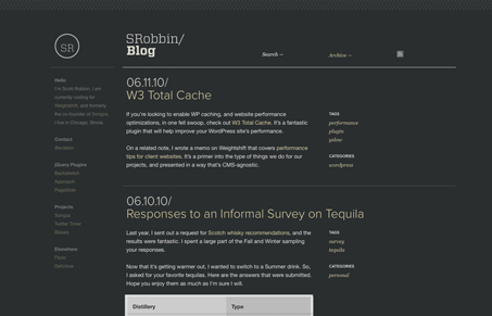
I love the simple and minimal design to this blog. I don’t normally go for a dark background site that has this much textual content on it, but everything here seems to be really set in a way that’s not hard to read. There are also some subtle interactions here that also lend to keeping it interesting visually.
Glassmorphism: The Transparent Design Trend That Refuses to Fade
Glassmorphism brings transparency, depth, and light back into modern UI. Learn how this “frosted glass” design trend enhances hierarchy, focus, and atmosphere, plus how to implement it in CSS responsibly.


0 Comments