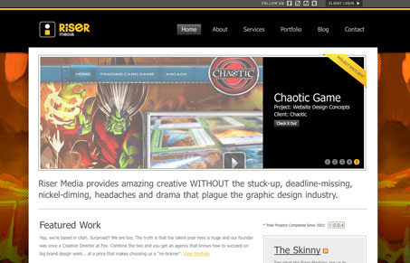
There isn’t anything on this site that’s rule breaking or trend setting, but what is here is done well and executed cleanly. The thing that catches my eye most is that the background will change out to match the main “featured” imagery from the portfolio, that’s a really nice subtle touch and that’s really what this website is all about. Really great steady work here.
Glassmorphism: The Transparent Design Trend That Refuses to Fade
Glassmorphism brings transparency, depth, and light back into modern UI. Learn how this “frosted glass” design trend enhances hierarchy, focus, and atmosphere, plus how to implement it in CSS responsibly.


0 Comments