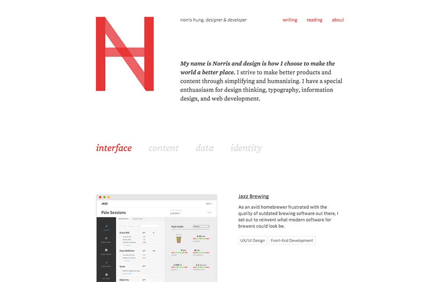
Portfolio site from Norris Hung out of San Francisco. Like the minimalist design. Also like when designers let you know what stack they use – this one built with Bourbon / Neat and Jekyll. Would like to see either links to the portfolio work itself, or allow for magnifying the images there so that we can see more – but like Norris’ site’s flow.
Glassmorphism: The Transparent Design Trend That Refuses to Fade
Glassmorphism brings transparency, depth, and light back into modern UI. Learn how this “frosted glass” design trend enhances hierarchy, focus, and atmosphere, plus how to implement it in CSS responsibly.


No-one else saw this logo and thought… Gmail.
haha! i see it now
imitation and flattery