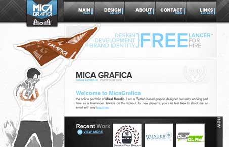
I like the blocky chunky feel this site has, the outlines around the illustrations really help keep it cohesive. The fixed header and scrolling page work well together on this design. The type has a hand altered feel to it and that’s also a nice touch.
Glassmorphism: The Transparent Design Trend That Refuses to Fade
Glassmorphism brings transparency, depth, and light back into modern UI. Learn how this “frosted glass” design trend enhances hierarchy, focus, and atmosphere, plus how to implement it in CSS responsibly.


0 Comments