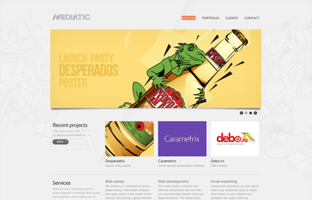
It’s not often you come across a site that has such a strong subtle design. I love the detail work in this site, after you first glance at it you start to see the deeper details over time. Then as you go through the sub pages it’s evident the level of quality and work that’s gone into the site. From the subtle background animation behind the main nav items to the way the portfolio samples load. My favorite part is the process graphic on the services page. Great stuff.
The Terminal Frontier: A Web Designer’s Unexpected Superpower
Unlock hidden superpowers with essential command line skills every web designer should know. Boost efficiency, control your workflow, and gain confidence by mastering the tools behind the scenes.


0 Comments