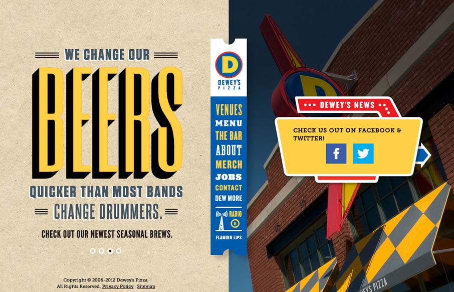
I usually hate when websites hit me with a ‘site soundtrack’, but in this case I really think it helps to complete the experience. The colors, texture, and typography go really well with the music.
It took me a little while to realize that the center banner is the navigation, but once I got it, I wanted to flip through every page. I think this kind of navigation is an example of how expectations can differ between users and designers. When the designer put that nav banner together, they probably already know how the site would transition horizontally from ‘page’ to ‘page’. They had that mental image of the page moving and the nav staying in place, which clear differentiates it from the ‘page’ content. But this creates a disconnect for the user, because they don’t have that same internal knowledge when they view the page for the first time. To them (what I really me is ‘to me’), the page is a static image. You’ll notice that on each ‘page’, the nav and two sides of content make one centered unit. They feel like they are part of the same piece of content. It’s only when the page transitions that the nav and content are effectively differentiated.
Still, the site is beautifully designed and is a great example of how to create a harmonious multimedia experience in a website. Dig it.


It’s an awesome site, thanks for posting
Seriously? Putting a website that contains auto-play music on your site? Really?
I guess you don’t like auto-play music Oliver? Could you try being more constructive?