
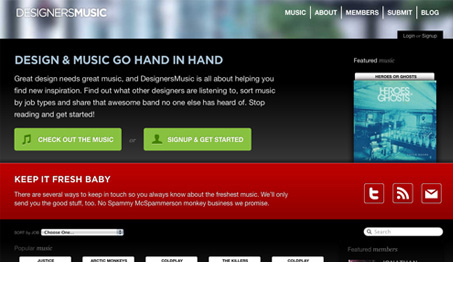
Love this site by Forty Seven Media. The concept is cool and the design looks great. I love the way the album covers are displayed with the little title above it and the pop-up when you mouse over each one is well done. I love the dark colors, somehow I get the vibe of being in an old used record store but still feel clean. Great work on the design here.




0 Comments