Found via: @MaxVoltar
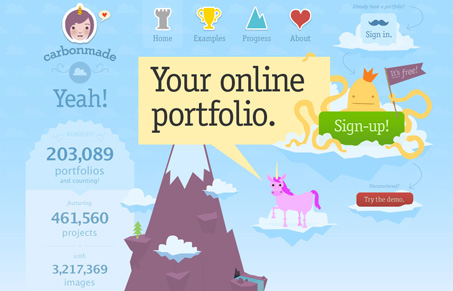
I can’t stop looking at the redesign of http://carbonmade.com/. Every single corner is amazing.
I love this redesign of carbonmade.com. The illustration work is just amazing, there’s something tucked away in every little nook and cranny to entertain you visually. The humor and detail put into these 3-4 main pages will keep you staring at the site for a long time.

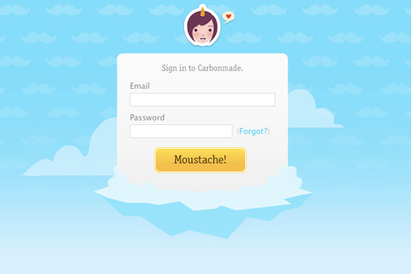
The sign in page is a great little microcosm of this site’s aesthetic. “Moustache” says it all…


I’d completely forgotten about CarbonMade!!! I was thinking of doing something similar to CarbonMade or Behance for my third-yea project uni, but wow, can’t top this. I love the progress page most of all, I’m quite excited with the idea of a new portfolio system too. Really accomplished design, well done!
Initially very pleasing visuals, but usability-wise the site is lacking. Shame also that follow-up pages do not visually deliver as the front page does.
Hmmm, not sure I agree with you on the lack of usability. Granted calling the submit button “moustache” is silly I don’t think it’s confusing at any point considering their audience is primarily web designers.