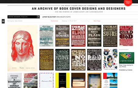
Aside form being an awesome design resource this design gallery gives you lots of covers to view at one time, the trouble is there’s tons of them. I’m not sure the drop-selector really holds together when you get into things like titles of book, etc… Overall though the gallery is clean and doesn’t impact my viewing experience of looking at the covers, what a well designed gallery should do. The detail pages are arranged really well and I like the way the comment form is handled. The footer area is also nice, there’s tons of info there and I like the way the site authors are communicating with you via page elements in the footer (like the road map for the site for example).
Glassmorphism: The Transparent Design Trend That Refuses to Fade
Glassmorphism brings transparency, depth, and light back into modern UI. Learn how this “frosted glass” design trend enhances hierarchy, focus, and atmosphere, plus how to implement it in CSS responsibly.


0 Comments