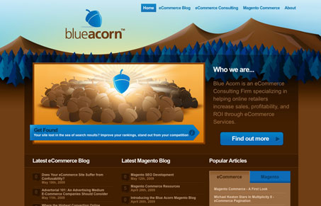
This is really one of the most well done detailed sites i’ve seen in a while. There are so many elements to this site it’s hard to spot them all. I think just about any format of HTML you can have in a website in regards to layout elements and content elements have been covered with this design. The detail work is pixel perfect and a joy to surf through. If there’s any one thing to point out about this site is that on a couple of pages I get content fatigue in just looking and reading everything. Less content per page may improve the readability of this site, but it’s not easy to say something like that on such a great website.
Sign-Up: Enhancing Conversions through good UX
Optimize your website’s sign-up process by focusing on clarity, ease, and user mindset. Clearly explain the purpose, benefits, and steps, and use social proof to build trust and drive conversions.


Hey Gene,
Thanks for the great review of the site, and we’ll certainly take your feedback to heart on minimizing the content on our pages and we appreciate that feedback.
We plan on some enhancements in the coming weeks, including a CSS style switcher and a night/day theme (the skyline background looks awesome in a night theme with stars twinkling), and we’ll make sure we look at simplifying our pages along with that.
Btw, was trying to get out to ConvergeSC but have some visitors in town that weekend, but would love to connect with you guys, we’re just around the corner in Charleston.
Sounds cool! Keep us in the loop when you roll out some changes.
Sorry to hear you’ll miss ConvergeSC, it’s going to be an awesome day for sure.