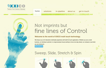
I like the illustrations and swipe icons that have been done for this website. The background and texture, suggesting the grime of a touchscreen is also a nice touch. I think that’s museo used and it’s interesting that I think this is the first time i’ve seen that typeface used without it being delivered via cufon or @font-face.
Glassmorphism: The Transparent Design Trend That Refuses to Fade
Glassmorphism brings transparency, depth, and light back into modern UI. Learn how this “frosted glass” design trend enhances hierarchy, focus, and atmosphere, plus how to implement it in CSS responsibly.


Just took a quick peek but it looks like the Museo is just graphics. Bummer.