
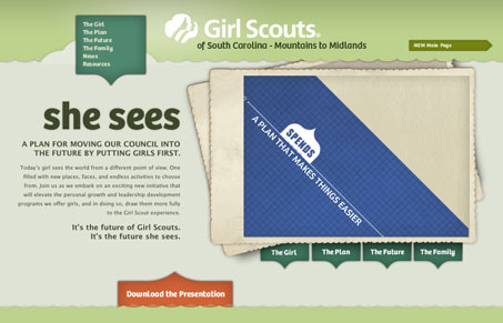
This page has a really nice feel to it, the colors really communicate the Girl Scout brand and the simple almost 3D feeling shapes really fit well within the design. The sub pages are also quite nicely done, with the shapes really helping to focus on specific content that’s important.



0 Comments