
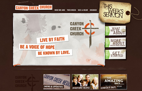
There are many, MANY church websites out there that unfortunately are terrible. That being said, it’s always a breath of fresh air to see a well-done, beautiful church website. I really like the textured, layered look of this site. The layout and content are also well thought out. The site is easily navigable, and it’s easy to find the information a potential visitor would be looking for.


Fitts’s Law: Why the Easy Button Wins
Large, close targets are faster to hit than small, distant ones, that’s Fitts’s Law. A look at the 1954 rule behind buttons, prime and magic pixels, thumb zones, and dark patterns.


0 Comments