
McMaster-Carr’s website is a rarity on the modern web, it doesn’t follow trends, chase aesthetics, or attempt to impress with gimmicks. Instead, it just works. Efficiently. Reliably. With a brutal focus on function over flair, McMaster-Carr has quietly built one of the most purpose-driven user experiences in online commerce, and they’ve barely changed it in decades.
A Catalog Mindset, Digitally Translated
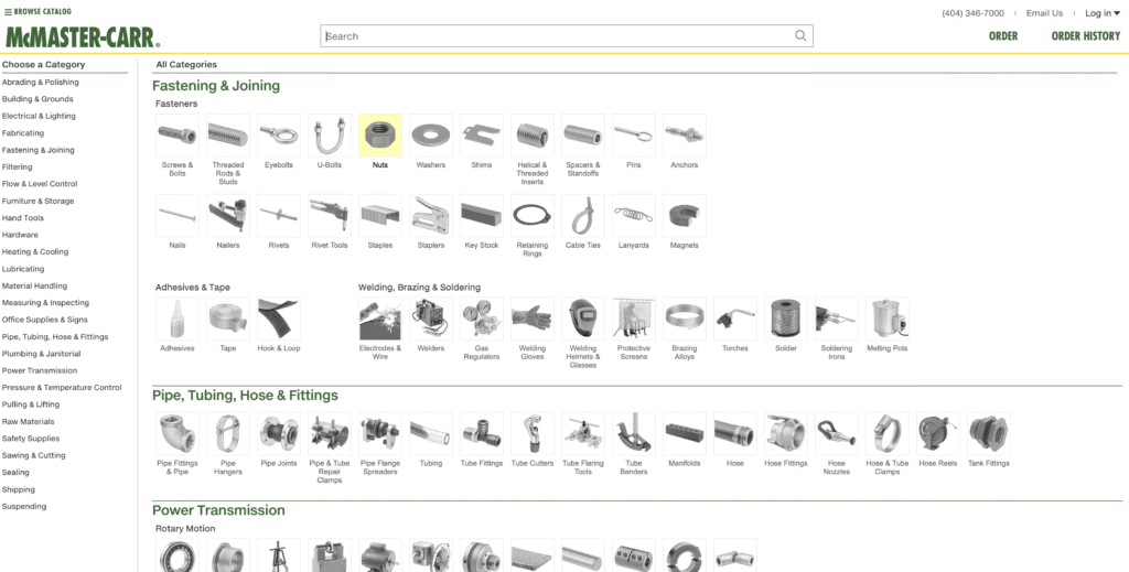
Since its founding in 1901, McMaster-Carr has always served a specific audience: engineers, fabricators, mechanics, and maintenance pros who value speed and clarity above all. Their famous print catalog was dense, detailed, and obsessively organized. When the digital shift arrived, McMaster didn’t reinvent themselves, they simply translated the catalog’s usability into HTML.
The result? A site that looks frozen in time but outperforms many modern designs.
No-Nonsense Design for People Who Don’t Have Time for Nonsense
There’s no carousel, no dark mode toggle, and no pop-up asking if you want 10% off your first order. What you get instead is a clean, muted layout with fast access to product specs, technical filters, and CAD files. The hierarchy is built to guide utility, not push sales. Everything from the typography to the color scheme screams clarity and speed.
This isn’t minimalism for style’s sake, it’s minimalism because the user needs answers, not ambiance.
Engineering-Grade Performance
Dig into the frontend and it becomes clear: this site is engineered like the parts it sells.
- Server-rendered pages ensure ultra-fast loads and accessibility, even on slower networks.
- Minimal JavaScript reduces bloat and boosts compatibility across devices and browsers.
- Optimized asset delivery means crisp visuals without choking bandwidth.
- Predictable UI helps reduce user friction, once you learn how to browse one item, you’ve learned them all.
There’s a reason it feels snappy: it was built to be that way, not accidentally, but by design.
Designed for the Right Audience, Not Everyone
While most ecommerce sites try to appeal to everyone, McMaster-Carr zeroes in on its core audience. Every feature, from parametric filtering to downloadable engineering files, is tailored to technical buyers. The layout, though visually plain, makes it easy to process vast amounts of data in a single glance, a direct nod to its engineering roots.
For users working on deadlines or building critical infrastructure, that’s far more valuable than any slick UI animation.
What Designers Can Learn from McMaster-Carr
McMaster-Carr is proof that design isn’t about decoration, it’s about intention. Every decision on their site serves a user need, not a marketing pitch. In a world obsessed with the new and shiny, they’ve chosen to optimize what works.
Here are the key takeaways:
- Design for performance, not applause.
- Let the content structure the experience.
- Don’t add anything that gets in the user’s way.
- Know your audience and be ruthless about serving them.
A Frontend That Defies Trends
The McMaster-Carr website is not for everyone, and that’s the point. It’s built with clarity, speed, and purpose at its core. While most brands chase attention, McMaster earns loyalty by respecting time. For frontend designers, it’s a reminder that sometimes the best user experience doesn’t come from the latest trend, but from never losing sight of who you’re building for.
| Priority | Core Principle on McMaster-Carr | Quick Wins |
|---|---|---|
| Ruthless speed | Server-rendered pages, minimal JS, compressed assets | Pre-render high-traffic pages, defer all analytics scripts |
| Single-minded user focus | Every UI element exists to speed up decision-making | Pin top-used actions on dashboards, hide upsells one layer deep |
| Consistent layout | Uniform structure across millions of SKUs | Standardize navigation and templates across all sections |
| Data-dense, scannable UI | Tight tables, readable typography, low visual noise | Use sortable tables over complex charts, optimize for keyboard nav |
| No frivolous elements | No pop-ups, autoplay, or banner fatigue | Eliminate entry modals, shift signups to in-content areas |
| Workflow integration | CAD files in multiple formats per product | Add raw file downloads or templates where relevant |
| Plain visual style | Neutral palette, stable UI, no gimmicks | Replace flashy effects with subtle cues and trust indicators |
For a deeper dive into the techniques that make McMaster-Carr’s website exemplary, watch this:


0 Comments