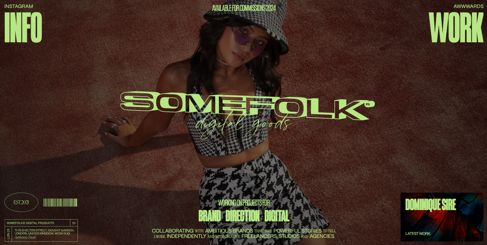
Pretty rad look and feel to this website design. I love the oversized type and the colors used in contrast with the “dark” photography used. I also find it very interesting that the top part of this design starts to look like or at least interacts like a YouTube card does – noting the little square in the bottom right corner.
Glassmorphism: The Transparent Design Trend That Refuses to Fade
Glassmorphism brings transparency, depth, and light back into modern UI. Learn how this “frosted glass” design trend enhances hierarchy, focus, and atmosphere, plus how to implement it in CSS responsibly.


0 Comments